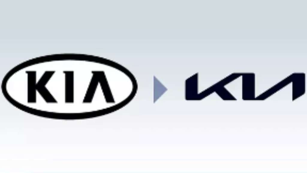
Recent KIA rebrand
A rebrand is usually a business’s chance at redemption – whether they’ve moved past the aims of their initial branding, or are keen to avoid unsavoury associations, a rebranded business is aiming for new, never-before-seen heights. We’ve already covered this in our blog post about rebranding, so have a look if you missed it!
KIA recently rebranded their company, going for cleaner lines and a more futuristic vision. It’s true that they’ve changed tactics, but there were some small hiccups along the way. We’ll be discussing what they changed, how they went about it and whether it was for the best.

Aims and promises
As a vehicle manufacturing company, KIA is now presenting itself as one of the leaders of the electric car market. The company is committed to becoming an “icon for change and innovation.” This is clearly shown through the fact that their newest releases feature electric vehicles, which tie in nicely with their new branding.
KIA’s aims are to popularise electric vehicles, as well as to tailor their mobility services to market needs. Their rebrand has brought these main aims to the forefront of both their consumer’s minds and also their internal focus.
KIA’s confusing logo
KIA aimed to mark a clear division between their old company and this new vision of theirs. Not only did they change their business strategy, but they also updated their branding materials with a new logo. However, there was some confusion – Google searches spiked for ‘KN cars’ due to some people misreading the font. The new logo was supposed to be a reflection of the company’s symmetry, rhythm and confidence, which embody KIA’s commitment to its customers.
Their jarring logo change comes alongside an updated tagline – ‘Movement That Inspires’. With this, their new aims and broader vision of mobility are displayed in a clearer way – their old tagline was ‘Power To Surprise’. Although there have been extremely mixed reactions to their new logo – some positive, some negative, it’s clear that their rebrand was necessary for their updated vision.

A record-breaking rebrand
KIA unveiled their new look in a glittering event, during which they also broke a Guinness World Record. They had the largest number of UAVs (drones) launching fireworks ever, which also acted as their statement of intent – with explosive results!
This rebrand has been said by some to reflect the evolution of their business, and reflect their broader vision of mobility. It’s been in the works for a while – their Plan S strategy highlights a shift towards electric vehicles and cements them as holding a strong leadership position. This rebrand was also a break away from their traditional manufacturing business model, to align with their expansion into future mobility services.
Thinking of the future
In line with their new and innovative focus, the KIA brand appears to be evolving and maturing. Not only does this change how the audience views them, their internal departments now have a stronger focus on their vision. Between their outdated branding materials and differing methods of marketing themselves and their product, it’s clear that without a rebrand, they wouldn’t have been able to integrate their change of pace correctly.
So, what do you think of the KIA rebrand – is it clear what they stand for? As a marketing agency, we’re all for creative expression, but we think the logo could be bettered with a little more spacing between letters. Otherwise, the sleek and futuristic design is a great indicator of their new direction – and very striking!

…And park!
There you have it – everything you need to know about the 2021 KIA rebrand. We’ve covered their intentions behind the new logo, and how it was received. Depending on what you thought of their rebrand, hopefully you now realise how important branding can be to a business.
If your branding needs bettering, consider getting in touch with the Identity Agency. We’ve seen it all, so rest assured we’ll do what’s best for your business. Take a look at our previous work to see if we’re the right fit for you!
Related articles:
Discover more from Identity Agency with related posts that offer valuable insights, tips, and industry trends to keep you inspired and informed.


