2023’s Worst Designs
Even though we’re not even remotely close to halfway through the year, there have already been some standout mishaps in the design world. We’re showcasing the most obvious design fails of 2023 so far, so you can learn from their mistakes and know what NOT to do when you’re tasked with coming up with a design. Brace yourselves…
1 – Unreadable menu

Waiter! There’s words on my food! I can’t even tell if this is a formatting error or a fade effect gone seriously wrong – but the lack of colour really signifies that this menu designer had no idea what they were doing. Credit to u/darkdetective on Reddit.
2 – Amazon chroma key towels
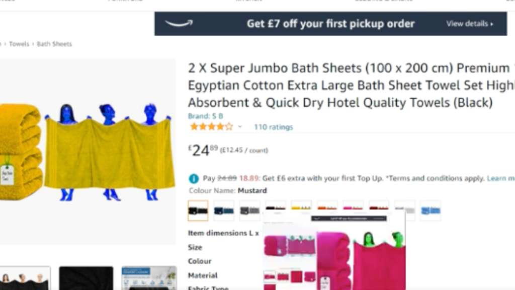
Coming straight to Earth from far away, these aliens knew they were headed towards their greatest treasure: super jumbo bath sheets. I know the image has obviously been recoloured, making these women every colour of the rainbow, but the text could also do with an edit. This one would have benefitted from a second pair of eyes; or maybe the aliens were the ones to give it a look-over? Blame u/danatron1 on Reddit.
3 – Chiropractor was too strong

Chances are, this chiropractor is to die for. There was a very imaginative creative vision for this one, but unfortunately, it wasn’t the time or the place! We’ve already discussed design choices in one of our blogs, so have a read if you’re trying to avoid making similar mistakes. Spotted by u/froopy_doo on Reddit.
4 – Incorrect alphabet
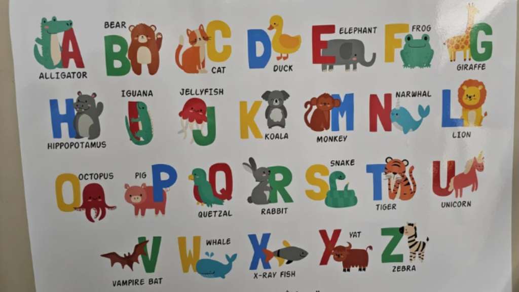
At first glance, there’s nothing wrong with this – but on closer inspection, IT’S ALL LIES! The designs are really nice, but loads of the letters are in the wrong place, which is going to make it very difficult for whoever’s learning the alphabet from this poster! There’s also a misspelling, creating the mythical Yat, and listing unicorn as the only mythical creature on the poster is sure to create some upset. Found by u/shortybobert on Reddit.
5 – Heavy-handled

This poor pan is almost unusable, thanks to the weighty handle. It would, however, make a great paperweight! You would just have to make a ton of food in it to make it viable – I’m interested in helping with the safe storage of said food; just let me know. Posted by u/Hell_Awaitz on Reddit.
6 – Delicate

So, what are you meant to do with it?! If you think I’m making special allowances for you, jumper, you’re sorely mistaken – all my clothes go in the washing machine together, and only the strongest survive. Highlighted by u/FuzzboarEKKO on Reddit.
7 – Lovely try!
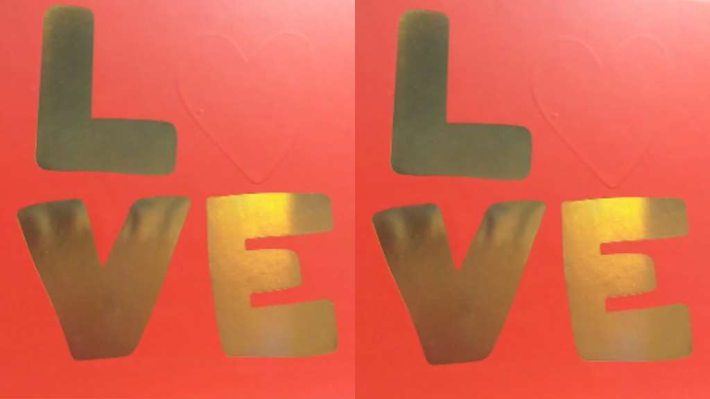
This is an accurate depiction of my love life (or lack thereof) – and something I wasn’t expecting to have to deal with at work, too. Or maybe this is a clever advert for a camouflage company? Whatever it is, it makes me sad. Thanks, u/AkwardGayPotato on Reddit.
8 – Windowless, soulless

This house looks like the dungeon I made for my Sims. All that’s inside this house is a fridge, a toilet and an easel. Now make me some money! Joking aside, it really is a shame that they put such an effort into building a horrific house – and now I have the sudden urge to condemn a poor innocent soul to a life of incarceration, never to see the sun again. This is your fault, u/TeeNelly on Reddit.
9 – You’re driving me mad!

We can take a good guess at what it’s meant to say, but it’s really unclear! Bonus points for the spelling mistake on ‘Britain’. This really sums up the current state of the country. u/okrafest on Reddit, thanks for enlightening us.
10 – Panic!
Sometimes, it’s best to stick to conventions – if colours have an association with them, like red for danger, don’t mess around with them! The person responsible for this should have really read our blog post about colour theory… u/miaisabridge captured this.
Honourable mention

We couldn’t keep this one just to ourselves, enjoy this oddly unsettling horse. Sorry about this. Look into its eyes. There is a century’s worth of regret in there – things he should have done, the mare he loved… This one was from u/Better_Weakness7239 on Reddit.
MY EYES!
Hopefully, you’ll avoid making similar mistakes in your own designs. Although they were fun to laugh at, remember that everyone starts out somewhere – every mistake is a learning experience! To prevent some creative agency from making a whole article about your mistakes, contact us to talk design, consultancy or graphic design.
Related articles:
Discover more from Identity Agency with related posts that offer valuable insights, tips, and industry trends to keep you inspired and informed.


