Let’s look at logos!
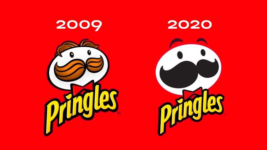
Are you still mourning the Pringles redesign, or do you think he looks cool and hip? Logos have faced many design changes since their inception in order to stay fresh in an ever-evolving landscape. From 3D-looking, realistic images which were all the rage not so long ago, to a more flat and minimal of the current era, they’ve been through a lot.
This article will follow the progression of logos, reasons why they’ve changed so much, and some examples of the adaptions they’ve faced!

A history lesson
Logos have been around almost as long as we have! In primitive times, cave paintings could be classed as early logos, which led to hieroglyphics from the Egyptians. Medieval Europe birthed crests – and the illiterate population relied on barber shop poles and other signage to differentiate their shops.
The printing press, invented in the early 15th Century was also intrinsic to the creation of logos – leading to wider advertising like newspaper adverts and posters. As business boomed and the wider population had a disposable income for the first time, commercial logos began to spread.
In the 1900s, logos were plentiful! They were usually ‘flat-designed’, which means no shadows and a focus on being clean, simple, and 2D. Logos then grew in importance, and people began to see symbols as impactful images that could promote a business.
Skipping forwards to the 1990s (or we’d be here all day, and my boss is really strict on word count!), and many brilliant logos were beginning to emerge. CGI and computer-aided-drawing technologies strode ahead thanks to personal computers. When Adobe’s packages emerged, digital graphic design was now more accessible, and designs began to change!

Skeuomorphism
Skeuomorphism is when an object’s depiction closely matches its real-life counterpart. For example, the floppy disc icon denotes the button for saving (until the floppy disk became obsolete).
The idea behind it was to familiarise new users with an alien technology – if the icons matched things they were already used to using in their daily life, they could find their way around this complex interface more easily.
With apps, it was difficult to design an eye-catching logo in such a small space. Many turned to skeuomorphism to create an easily-recognisable core element in a 1:1 square, bringing 3D images with gradients, drop shadows and fake textures.

3D designs
However, the invention of intuitive touchscreen technology meant that it was now easier than ever to use, and skeuomorphism was phased out. 3D designs were now considered unappealing because of their bevelled edges and reflections. 2D design conserved space, and also gave things a cleaner feel, as well as allowing more abstract design choices.
Higher resolution screens have allowed for cleaner lines. Some sceptics claim that 3D logos, including shadows and bezels, were used to hide low-resolution flaws. A great example of this change in action is the new Instagram logo. You can clearly see in the image above just how this design change impacted the new brand direction of the company.
Apple’s iOS 7 update all but eradicated the skeuomorphic style when they went back to the 2D style. Logos also take less time to make and are higher quality when flat – after all, the vector design is easy to resize without losing detail.
However, many are calling for skeuomorphism to return – although it really never left! Vibrations and clicking sounds from typing on mobile resemble real noises from life; like pressing buttons or using a typewriter. People are speculating that it’s only a matter of time before it does return, as logo design has followed a cyclical pattern from 2D to 3D up till now. With virtual reality as an upcoming technology, realistic logos might be starting to claw their way back already!

Let’s go!
Okay, now you know all you need to about logos! We hope you enjoyed travelling through time to discover their origins in medieval times, and how they’ve adapted in recent years. All in all, whether a logo is 3D or 2D, as long as it adequately shows your brand in its best light, it’s wonderful!
Related articles:
Discover more from Identity Agency with related posts that offer valuable insights, tips, and industry trends to keep you inspired and informed.


